Fitting the Noise
Data Science
Feb 2018
I'm still not in a place to really produce some original, quality analysis of my own yet, so I thought I'd teach you all about what is probably the most common pitfall in data science: over-fitting.
In very broad strokes, machine learning consists of splitting your data set into two chunks: a training set and a test set. Then you take whatever model you are attempting to use, whether it's linear regression, k-nearest-neighbors, or a random forest, etc., and "train" it on the training set. This involves tuning the hyperparameters that minimize whichever error function you're using. In other words, when you train your model, you are taking your function and finding a way to best fit it to the training data. Finally, you take that trained model and see how well it performs on the test data. This type of machine learning is called supervised machine learning, because we know the answers in our test set, and can therefore measure how well our model performs directly.
Several interesting themes emerge when attempting to fit models to data like this. Allow me to illustrate with a somewhat lengthy example (credit goes to this talk from Dr. Tal Yarkoni at the Machine Learning Meetup in Austin for the overall structure of this example. However, the code which underlies it this analysis is my own).
Here's some data:
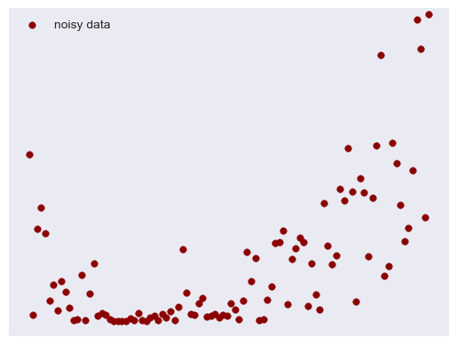
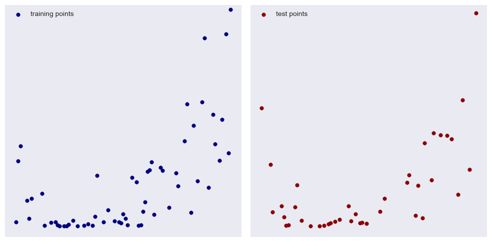
I created a simple quadratic function and added some normally distributed noise. Our goal is to find a polynomial that best fits this data. First, we randomly pick out 60% of our data on which to train, leaving 40% used to test our model. I mainly chose these proportions for illustrative purposes:
With the naked eye we can detect an overall upward trend, perhaps with a little bump at the front (your brain is pretty good at finding patterns). Lets try a linear fit (i.e. a first degree polynomial):
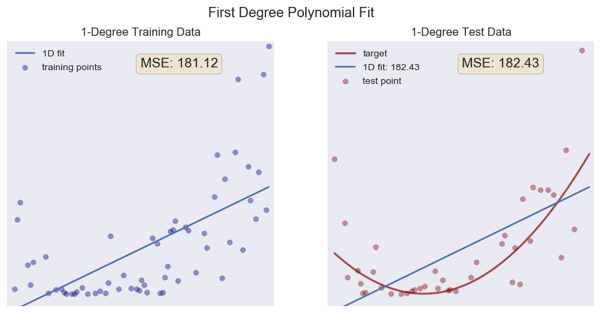
On the left in blue, we see the training points along with the best fit line of our model. Overall, our model doesn't really capture the overall trend of our data. We call a model like this underfit. The program is using least squares regression, trying to minimize the sum of the squares of the residuals (a residual is the difference between what the model predicts and the actual value of the data—we use the square so a positive residual is not canceled out by an equal but negative one). On the right, we see the test data, the same linear model, and, plotted in red, the actual function I used to create the data. Notice the MSE value on each graph. MSE stands for the mean squared error and is a calculation of the average of the squares of the residuals. The gist is this: the closer to zero we can get the MSE, the better our model. There are many and better ways to measure the success of models, but for our purposes here the MSE will suffice. Let's try a quadratic function (2nd degree polynomial) and see if our MSE decreases.
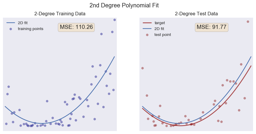
Pretty good! Notice how close to our target function we get, despite the noise I added (I imagine that normally distributed noise with a small standard deviation averages out in this situation). Our MSE for both our training data and our test data are a lot lower than our linear fit. We should expect this, since the actual function I used is a 2nd degree function. This model actually captures the underlying structure of the data. Often we don't have the luxury of knowing this, but we're learning here, so it's okay.
Now, lets make our model more complicated, really trying to fit the training data with a 10th degree polynomial:
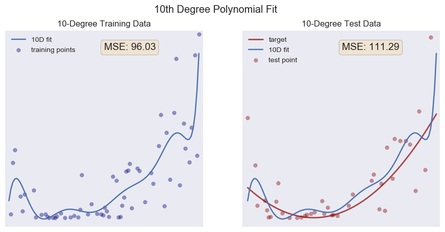
Aha! Something interesting has happened. Notice how the MSE on our training data is better than our 2nd degree fit. The 10 degrees of freedom allow the model to squiggle up and down, getting close to all the little bumps and dips in our training data. But look what happens when we test our model: the MSE is greater than our 2nd degree fit! Here, at last, is the impetus behind the title of this post: we have no longer fit the underlying structure of the data—we have fit the noise instead.
The terms signal and noise come from electrical engineering: the signal is the goal, the underlying "truth" of the matter, while the noise is all the extra bits of randomness from various sources. For an accessible introduction to all of this, I highly recommend Nate Silver's The Signal and the Noise: Why So Many Predictions Fail—but Some Don't. When we test our model against data it has never seen, it fails because the model was built to satisfy the idiosyncrasies of our training set. Thus, when it encounters the idiosyncrasies of our testing set, it misses its target. The model is overfit.
In the real world, we don't really know the underlying structure of the data. So how can we guard against overfitting? How do we know if we are fitting the noise or if we are beginning to capture the underlying signal? One way to check ourselves is to run multiple "experiments." Keeping our overall dataset the same, we can randomly choose different training and test sets, creating models and tests for each one. Let's do this and plot all of the fits as well as the average fit:
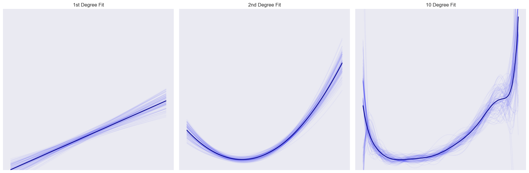
Each of the 100 fits I ran is plotted as a faint, blue line, while the mean fit is plotted with the dark line. We can learn a lot from these graphs. First, notice that the first two graphs don't change much. Each model, no matter which 60% of the points we sample, turns out about the same. But take a look at the 10 degree fit: it's much more wild, sometimes up, others down, bumps here one time, not there the next. This is a nice illustration of variance. The first two models have a low variance: the same point doesn't change a whole lot from model to model. The 10 degree fit has a high variance, with a single point having a much wider range of movement.
I gathered all of the error data for each of these fits:
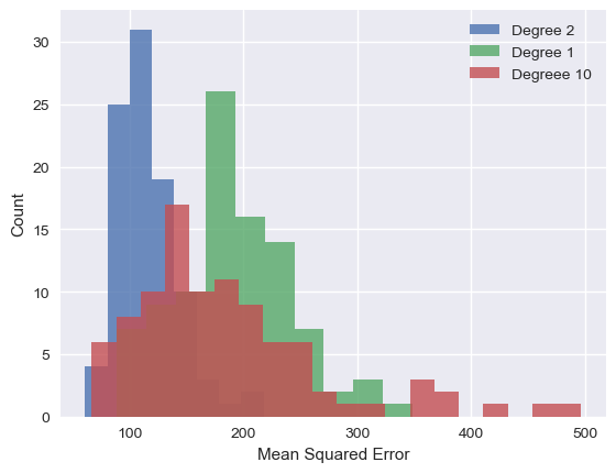
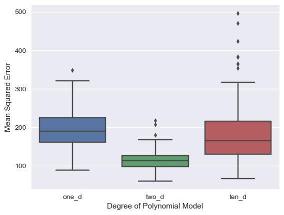
Here we can see the accuracy and the variance. Notice the tall peaks in the histogram for the one and two dimensional models. The errors are all clustered pretty close together (i.e. each model isn't changing too much from iteration to iteration). This is especially noticeable in the boxplot of the two dimensional fit. The colored area represent the central 50% of the measurements, also known as the inter-quartile range or IQR. Notice how narrow it is compared to the other two models.
Directly related to the problem of under/overfitting your data is the bias-variance trade off. In a nutshell, bias can be defined as error introduced to your prediction due to assumptions made about the structure of the underlying data. In our case, models with a lower degree have a higher bias. The 10 degree polynomial has more degrees of freedom, so it is less constrained with respect to the shapes of trends it can model, whereas the linear and quadratic cases can only model straight lines and parabolas, respectively. However, combining this with what we've already said about the variance of each of models, we see there is a trade off. Models can generally have high bias and low variance, or they can have a low bias and a high variance. Often, the job of a data scientist is to find the sweet spot in the middle. Like this:
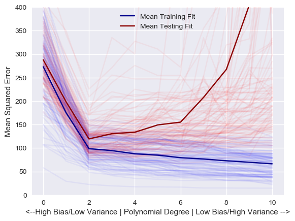
I have to say I'm proud of this little graph (it was the culmination of four days of coding in between being a dad). I modeled the same 100 training and test sets shown above with every degree of polynomial from 0 to 10, keeping track of the errors along the way. The result is this graph. The average fit is shown with the dark lines. You can see that the blue training line steadily gets closer to zero as we increase the degree of the polynomial. In other words, the more degrees of freedom we give our model (low bias), the better it can fit the training data (and actually, if we have 60 degrees of freedom, it would have a training MSE of exactly zero, since it could produce a function that goes exactly through each of the 60 training points).
However, as we run those models on the testing data, they get substantially worse as our degree increases (the red line). This increased error is due to having fit the noise of the training data. Since this noise changes with each set, each model varies wildly. We have decreased the bias of our underlying assumption at the expense of greater variance and unpredictability. What we are after is the lowest error along that red line: surprise, surprise, a degree of two! Data scientists use a similar technique to tune their models and discover the underlying trends in their data.
As hinted at above, real world cases are not this cut and dry. The models are much more complicated with many more variables and features involved. Often, the scientist has very little information about the underlying structure, and sometimes the model's accuracy won't be known until more data is captured. But overfitting—fitting the noise over the signal—is a problem with which every data scientist must contend on a daily basis. And now you know why!
For all your fellow Python lovers and data heads (or just for the curious), check out the complete code for this post on my GitHub page! I'd love your feedback.
Afterward
While thinking about and writing this post, I was struck by its use as an analogy for many of our society's problems. We have evolved to find the patterns around us: this seemingly causing that, event A always following event B, etc. Our brain's pattern-finding behavior was a distinct evolutionary advantage and probably primarily responsible for our rise to dominant species on the planet. But it can also lead us astray: we stereotype and let those stereotypes invade our social systems to the deepest levels; we tend to think tomorrow will be like today and have a difficulty imagining long time spans, leading to doubts about climate change and the like; we let the few speak for the many, with so many of our squabbles revolving around which few get to speak for which many. I can see how these are all like the problem of overfitting: we use too few data points to generalize to the world around us. Keep an eye on your models of the world friends! Don't be afraid to let a little more data into your brain!
:o)